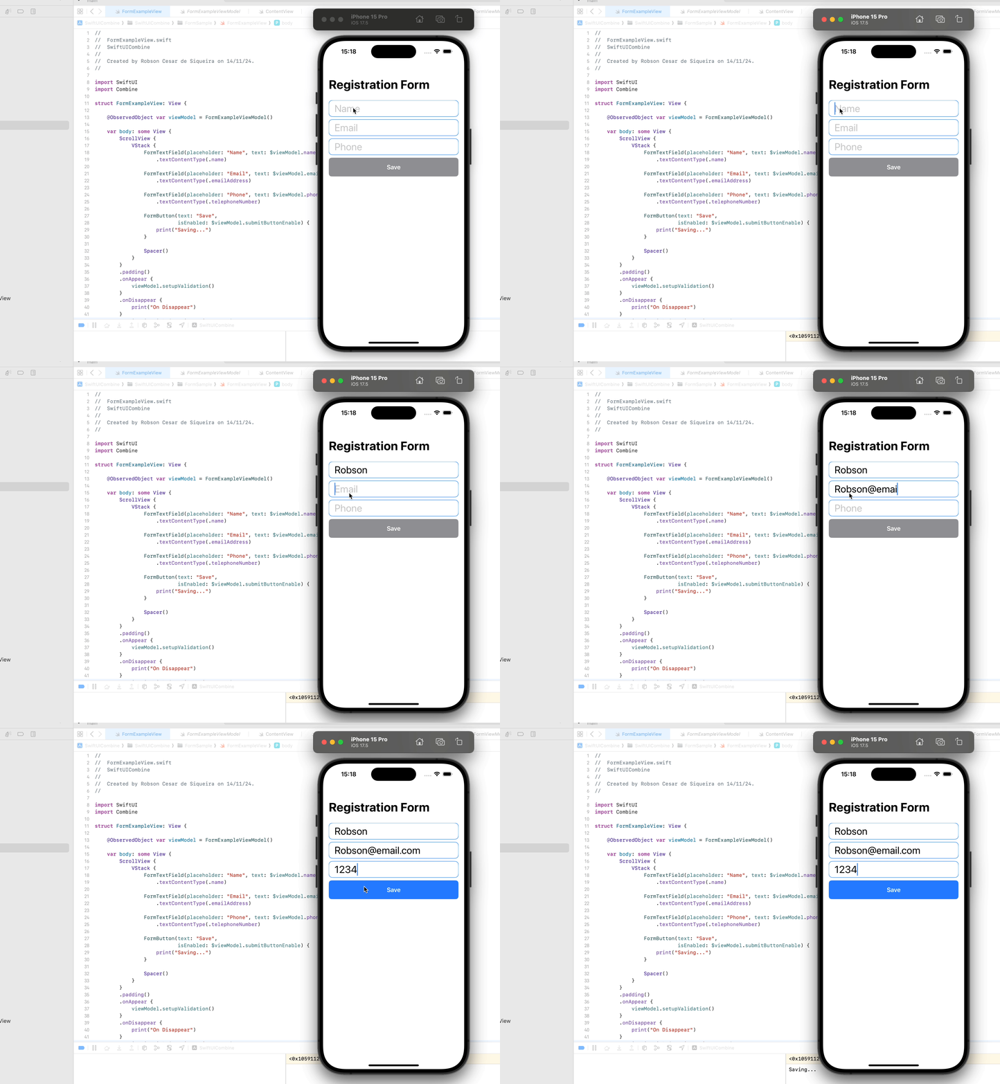
Custom views are one of the key features of SwiftUI, enabling developers to build reusable, modular components that simplify UI development. In this article, we explore four custom SwiftUI views—LoadingView, FormErrorMessage, FormButton, and FormTextField—and discuss the benefits of using such components in your projects.
Custom Views Overview
1. LoadingView
The LoadingView provides a reusable overlay with a loading indicator, designed to communicate progress or indicate that an operation is in progress. It uses a semi-transparent background to obscure the underlying content while keeping the user visually engaged.
Code Snippet:
struct LoadingView: View {
    var body: some View {
        ZStack {
            Color.black.opacity(0.4)
                .edgesIgnoringSafeArea(.all)
            ProgressView("Loading...")
                .foregroundColor(.white)
                .padding()
                .background(Color.gray.opacity(0.8))
                .cornerRadius(10)
                .frame(maxWidth: .infinity, maxHeight: .infinity)
                .edgesIgnoringSafeArea(.all)
        }
    }
}
Benefits:
- Clarity: Provides a clear visual indication that the app is busy.
- Reusability: Can be used across multiple views whenever a loading state is needed.
- Consistency: Ensures a unified look for loading states throughout the app.
2. FormErrorMessage
The FormErrorMessage displays an error message in red to alert users of invalid or missing input. Its visibility is controlled by a binding variable, making it easy to integrate with form validation logic.
Code Snippet:
struct FormErrorMessage: View {
    var text: String
    @Binding var show: Bool

    var body: some View {
        if show {
            Text(text)
                .font(.headline)
                .padding()
                .fontWeight(.bold)
                .frame(maxWidth: .infinity, alignment: .leading)
                .foregroundColor(.red)
        }
    }
}
Benefits:
- User Feedback: Provides immediate and clear feedback to users.
- Dynamic Visibility: Can be toggled on or off using a binding variable, integrating seamlessly with form logic.
- Improved UX: Enhances form usability by guiding users to resolve errors.
3. FormButton
The FormButton is a customizable button component that adapts its appearance based on whether it is enabled. It ensures a consistent look and feel for interactive elements.
Code Snippet:
struct FormButton: View {
    var text: String
    @Binding var isEnabled: Bool
    var action: () -> Void

    var body: some View {
        Button(action: action) {
            Text(text)
                .fontWeight(.semibold)
                .foregroundColor(.white)
                .frame(maxWidth: .infinity)
                .padding()
                .background(isEnabled ? .blue : .gray)
                .cornerRadius(8)
                .disabled(!isEnabled)
        }
    }
}
Benefits:
- State Awareness: Dynamically enables or disables the button based on the form’s validation state.
- Consistency: Ensures all buttons in the app have a uniform appearance.
- Reusability: Can be used across multiple forms with minimal configuration.
4. FormTextField
The FormTextField is a styled text input component with a rounded border and a placeholder, providing a more visually appealing alternative to the default TextField.
Code Snippet:
struct FormTextField: View {
    var placeholder: String
    @Binding var text: String

    var body: some View {
        TextField(placeholder, text: $text)
            .font(.title)
            .padding(.vertical, 5)
            .padding(.horizontal)
            .cornerRadius(8)
            .overlay(
                RoundedRectangle(cornerRadius: 10)
                    .stroke(Color.blue, lineWidth: 1)
            )
    }
}
Benefits:
- Improved UI: Enhances the look of the input fields with a border and padding.
- Ease of Use: Simplifies the integration of input fields with custom styles.
- Reusability: Reduces duplication by centralizing styling logic.
Benefits of Using Custom Components
- Reusability: Custom components allow you to reuse code across multiple views, reducing duplication and improving maintainability. For example,
FormButtonandFormTextFieldcan be reused in different forms with consistent behavior and styling. - Improved Readability: By encapsulating functionality into self-contained views, the primary view’s code becomes cleaner and easier to read. For instance, a view containing a form can focus on its layout rather than the styling details of individual fields or buttons.
- Scalability: Custom components make it easier to scale your app. If a style or behavior needs to change, updating the custom component will automatically propagate those changes wherever it is used.
- Consistency: Ensures that UI elements across the app look and behave consistently, providing a better user experience.
- Separation of Concerns: Decouples the UI logic from business logic, allowing you to focus on specific aspects of the app without affecting others.
Conclusion
The LoadingView, FormErrorMessage, FormButton, and FormTextField are excellent examples of how custom SwiftUI components can simplify your development process, improve UI consistency, and enhance reusability. By incorporating these components into your app, you can focus on delivering a seamless and scalable user experience. Custom views are an essential part of building clean and maintainable SwiftUI applications.
The FormExampleView and ViewModel
The FormExampleView is a SwiftUI view that presents a registration form with fields for name, email, and phone, utilizing custom components like FormTextField and FormButton. It integrates with an ObservedObject view model, FormExampleViewModel, to manage state and handle validation dynamically. The form enables the “Save” button only when all inputs meet validation criteria, ensuring a responsive and user-friendly experience. Additionally, lifecycle events such as onAppear and onDisappear allow for setup and cleanup actions, making the view adaptable and efficient for use in various contexts.
import SwiftUI
import Combine

struct FormExampleView: View {

    @ObservedObject var viewModel = FormExampleViewModel()

    var body: some View {
        ScrollView {
            VStack {
                FormTextField(placeholder: "Name", text: $viewModel.name)
                    .textContentType(.name)

                FormTextField(placeholder: "Email", text: $viewModel.email)
                    .textContentType(.emailAddress)

                FormTextField(placeholder: "Phone", text: $viewModel.phone)
                    .textContentType(.telephoneNumber)

                FormButton(text: "Save",
                           isEnabled: $viewModel.submitButtonEnable) {
                    print("Saving...")
                }

                Spacer()
            }
        }
        .padding()
        .onAppear {
            viewModel.setupValidation()
        }
        .onDisappear {
            print("On Disappear")
        }
        .navigationTitle("Registration Form")
    }
}

#Preview {
    FormExampleView()
}
import SwiftUI
import Combine

class FormExampleViewModel: ObservableObject {

    @Published var name: String = ""
    @Published var email: String = ""
    @Published var phone: String = ""
    @Published var submitButtonEnable: Bool = false

    public func setupValidation() {
        Publishers.CombineLatest3($name, $email, $phone)
            .map { name, email, phone in
                return email.isValidEmail()
                    && !name.isEmpty
                    && !phone.isEmpty
            }
            .assign(to: &$submitButtonEnable)
    }
}
The Source Code Repository
Check out the repository:
https://github.com/san0suke/swift-ui-combine2/tree/main/SwiftUICombine/SwiftUICombine/FormSample
